Pittsburgh Food Photographer Archive – Scallops
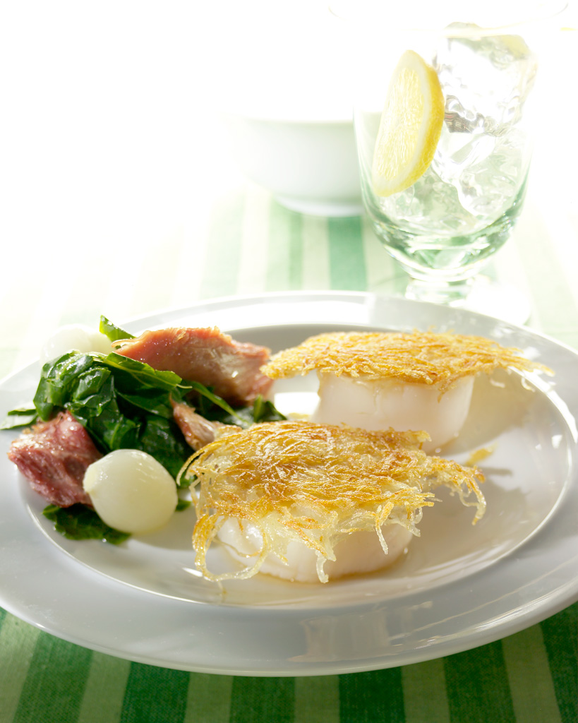
This is a shot that I did for Pittsburgh Magazine, quite a few years ago, but I think it still holds up pretty well. The shot was for a potential cover, so I needed to shoot it in such a way that there was plenty of room in the composition for the magazine’s masthead and various article headlines. Scallops are actually one of my favorite food, so I remember that I was looking forward to the excess food from the shoot, that I could take home and make for my dinner.
To simplify the background and make the masthead type easier to read and separate, we decided to blow out the background with lots of light, pretty much making it white, with just a touch of detail. This food photography technique is not always that easy to pull off. The real challenges is to make the background very white while trying to not affect the main subject matter. Most of the time there will be some sort of compromise where the subject is somewhat affected, and there have been many instances where the final photo ended up being really cool, because of the compromise… I call these things “happy accidents”.
Food Photographer’s Likes
I really think that the lighting on the food worked out really well. There is very nice shape and texture. The “glare” light (light reflected on the plate and food surface) is doing a very good job of adding texture to the top surface of the scallops and the spinach.
The focus is good on this, in my opinion. You can plainly see the food, but some of the food is going a bit soft, therefore adding a little drama to the photo. Not too much though, but just enough I think…
I like the props, the color of the tablecloth, the composition, and the food lighting.
Food Photographer’s Dislikes
No photo is perfect, and since hindsight is always 20-20, I’ll confess that there are a few things that I’d change, if given an opportunity.
The actually way the background is blowing out, now looks a little weird to me, and that’s something I’d change. I can’t quite remember how I did it, bit the column of “non-blown-out background items don’t work all that well, in my current opinion.
All in all though, I think that the food photo works pretty damn well… :o)


