Pittsburgh Photographer Michael Ray, talks about is Magazine photography shoot for Grocery Headquarters Magazine.
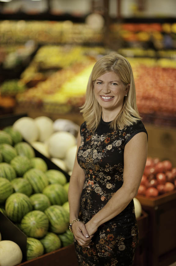
Project: Cover photo of the CEO of Giant Eagle, for Grocery Headquarters Magazine
Composition: You can see that the composition was pretty loose, to allow plenty of flexibility for the magazine’s Art Director. I needed to allow room for the magazine’s masthead above the subject and room for headlines on the left of the frame. Before the shoot, I asked for multiple samples of past covers that the Art Director liked, so I had an idea of what they wanted. This is always a good idea.
Camera / Lens / Focus: For location people photography, I usually shoot with my Nikon D700, using raw format, and it ended up being perfect for this shoot. I knew I wanted to keep the focus to a minimum, while still showing a lot of environment, I used my favorite lens for this shoot, my Nikon 85mm f1.4, and shot wide open. This lens has the ability to throw the background WAY out-of-focus, and I just love the bouquet effect. In fact, I don’t think I’ve ever shot this lens at any other aperture besides 1.4. The great thing about this lens, the limited focus, can also be the worst thing about this lens. It’s REALLY easy to miss focus, and make you look like a total fool, but when you do get it right, it looks amazing.
Lighting: From a lighting point of view, the tough part about shooting environmental portraits is finding or creating good light. Since I have a studio background, I usually try to find the composition first and then create the lighting effect I want. The trick is to match the light you’re applying to subject, with the ambient light in the background of your photo. You need to match the ambient light, in both quantity and color. If the lighting you are applying is a different color than the background light, then things tend to look a little weird. To help me with this, I have a Minolta color meter. This points me in the right direction. It’s trial and error after that. That’s where digital photography really comes in handy. Take a picture. If the subject is too blue, compared to the background, then add a warmer gel to the lights. Too yellow or green, add the needed color until you get it right.
Props / Environment: Since I was piggybacking with a video crew shooting a commercial, the background was somewhat refined and already styled to some extent. Even though I didn’t select the exact same area as the video crew, they were unsuspectingly helping my shot too. In hindsight, I wish I would of spun that one melon, in the bottom left of the frame, so the underside wasn’t visible, but there are always things like that you end up missing. I spun all the melons to hide the stickers, but missed the discoloration on that one.
Post Production: I really didn’t do too much retouching, just the normal blemish removal, teeth whitening, and that kind of stuff. It’s easy when the subject is so photogenic. Again in hindsight, I might of done a few other things differently, as usual. I figure that if you don’t find anything you’d change, you’re really not looking hard enough. I rally think the yellow behind the subject’s head is a little too strong and that melon behind her behind, could be toned down a little.
Conclusion: I like it… :o)
I just got this in from the publisher. This is how they ended up using it.


