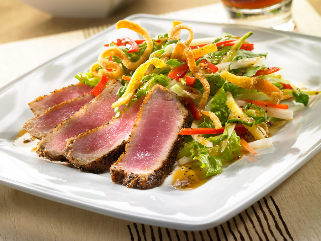
Pittsburgh Food Photographer shoots Tuna
I’ve been going through my archive, looking for food photos to add to the new food photography section of my Pittsburgh web site. I came across this photo and I think it deserves a place in the portfolio. At first, I thought I shot this a while back for Mitchell’s Fish Market, out of Orlando, but now, I’m not really sure… Anyway, I still like it… :o)
Too many photographers will prop a food photo in a way that makes the photo look unnatural, and not really know why. I really like the way the props in the background of this photo bleed out of the crop. Doing this give you a feeling that the environment of the photo keeps going and going, thus making the scene feel real. The geometry of this composition is really interesting to me. It feels balanced and natural, without feeling staged. I like the way the glass overlaps the plate, but the bowl in the back doesn’t overlap anything. And I just love the little triangle of beige in the top right corner. It seams to balance nicely with the objects on the right. If anything the food photo might have a tad too much foreground. Oh well… :o)
I think the lighting in this shot is really pretty good too. There is lots of shape and texture in the food, but what I think is really special are the reflections in in the surface of the foreground plate. Those kind of things are sort of happy-accidents that you just sort of notice and then, if you’re smart, accentuate.
What do you think?


